

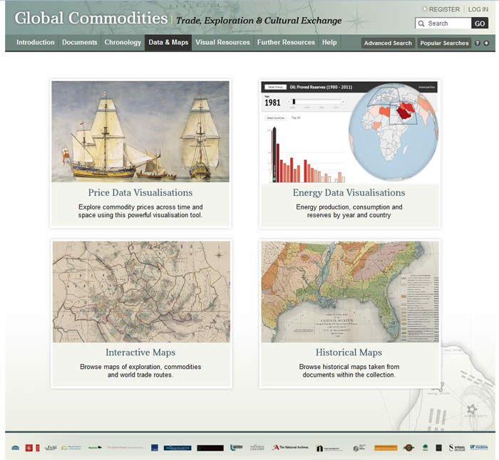
Data and Maps
By selecting ‘Data & Maps’ tab in the header of the resource, you can access the Price Data Visualisations, Energy Data Visualisations, Interactive Maps and Historical Maps.
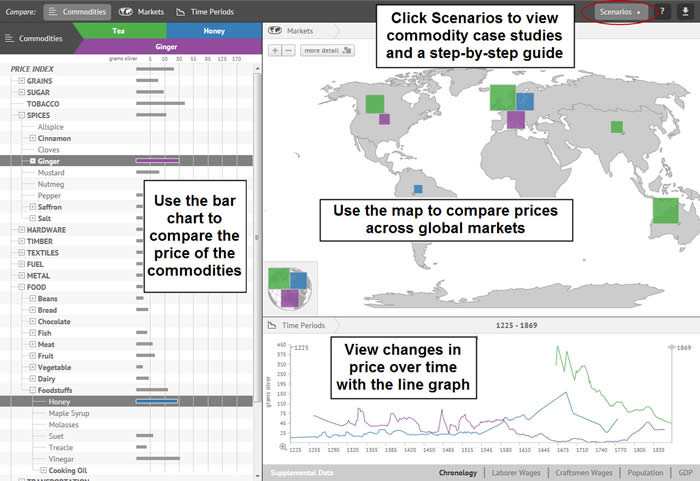
Price Data Visualisations:
Global Commodities features a unique data visualisation based on an extensive database compiled by leading scholars. This powerful tool enables you to explore commodity prices across time and space.
This data visualisation allows you trace the price of a wide range of commodities over hundreds of years and multiple global markets. Supplementary data also enables you to compare the prices data to wages, population and GDP while entries from our chronology provide additional background information and context.
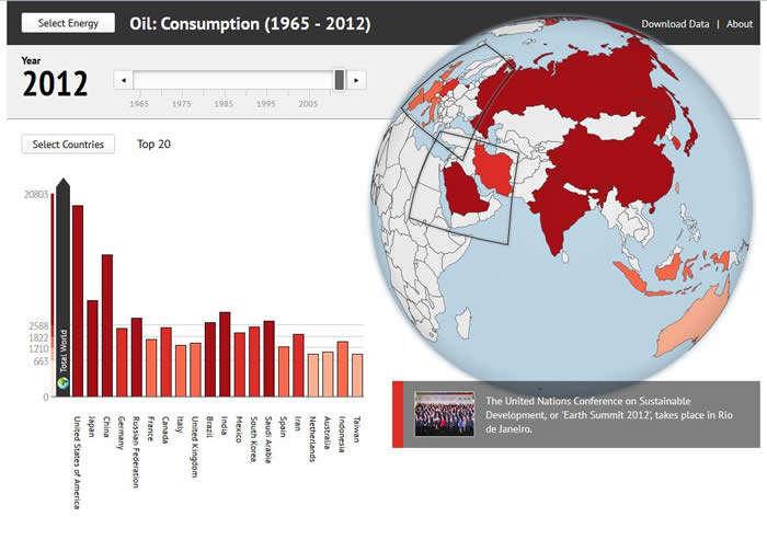
Energy Data Visualisations:
This energy visualisation has been compiled solely from the latest BP Statistical Review of World Energy and Historical Datasets. The review is considered one of the most widely respected and authoritative documents in the field of energy economics.
The data visualisation aims to provide a learning environment in which complicated data is represented in the most accessible way possible. Data can be filtered in a number of ways, and the results are projected against an interactive bar graph and globe.
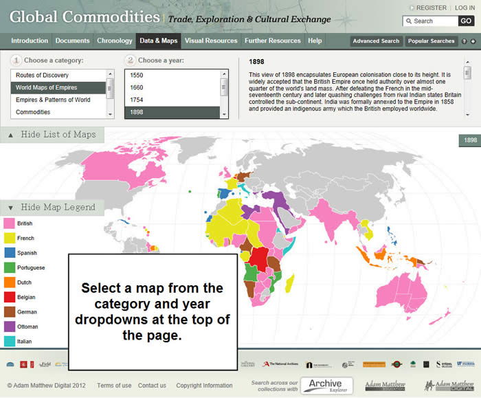
Maps:
Our set of interactive maps allow you to explore information related to global commodities, trade and exploration in a clear and engaging format.
Each map includes textual information to highlight significant historical and political details, making this an invaluable study aid.
Next: Visual Resources
Previous: Chronology