

Editor's Choice
Don't know where to start? The Global Commodities team pick some of their highlights from the collection.
Bringing Products and Packaging to Life
Philippa Hubbard
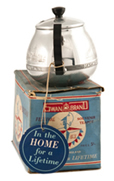
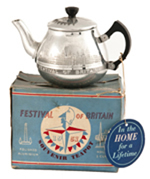 One of my choice picks from Global Commodities is the 360-degree Object Gallery showcasing items from the Robert Opie collection of brands, packaging and advertising. Teapots, cigarette packets, chocolate boxes and much more are brought to life using a 360-degree image viewer. This viewer enables the full rotation of objects seen on the screen and facilitates a form of close-up digital ‘handling’. For example, this souvenir teapot for the 1951 ‘Festival of Britain’ can be viewed head on as a single image but can also be rotated to show additional angles from the side and back of the object, allowing both the product and packaging to be examined in full in one seamless rotation. The ability to view 360-degree rotations in this way offers exciting research possibilities. It allows us to assess not only the words and images printed on the objects in the Opie collection but also their material form, which can provide
important information on an object’s original function.
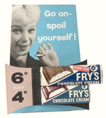
 By viewing the full rotation for this counter display for Fry’s Chocolate Cream we can analyse both the striking advertising image and the back of the object which suggests how its structure could be manipulated for display in shop windows and on shop counters in the 1950s. As well as objects from the famous Opie collection, the gallery also includes a number of images of raw commodities from coffee beans to a variety of spices. By viewing these items as 360-degree rotations we see their aesthetic qualities close-up as well as their full material composition, texture and form. The selection of 360-degree objects featured in Global Commodities offers a more material approach to research through a digital medium.
Set ‘em up, the sarsaparillas are on me!
Liz Sargut
 In the classic Hollywood Western “Riders of the Rio Grande” (1943), three fresh faced and naive cowboys enter a dilapidated saloon and politely order “three sarsaparillas”. Their choice of drink is roundly mocked by the grizzled denizens of the bar and a fight ensues, with the three greenhorns easily dispatching the tough guys.
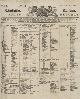
But the question which has always interested me is “just what was sarsaparilla?” I recently had the opportunity to find out more about this mysterious commodity when I came across a reference to it in a London Bill of Entry from the Merseyside Maritime Museum (Liverpool, UK). These fascinating printed records provide a detailed account of the nature, value and quantity of goods received into a port for importation or exportation.
Global Commodities features a number of these for the British ports of London, Liverpool, Bristol, Clyde and Hull. Many of these provide the details of the cargo entering ports across Britain everyday on a ship by ship basis, and record the origin of the ship, the owner’s name and the full details of the commodities. These daily reports and accounts have been bound into large volumes organised by year.
In the nineteenth century, the two great ports of the British Empire were Liverpool and London. Liverpool was the port of choice for British exporters supplying the Empire and much of the rest of the world with high quality manufactured goods. London imported more and specialised in speciality and luxury goods.
I was intrigued to discover that in January 1820, the port of London received around 800 bundles of sarsaparilla transported in the ship “Pomona” from Paraguay. Most of the imported sarsaparilla root came into Britain through London and in 1831 nearly 180,000 pounds of the root were reported as having landed in the city. Today it is probably only remembered as the non-alcoholic cordial in a Wild West bar, but in its heyday it was traded across the world, became the subject of learned papers and was used for medicinal and recreational purposes.
Sarsaparilla is obtained from the roots of a trailing vine (Smilax Regelii) which is native to Central and South America. It was widely used by Native Americans for medicinal purposes and in Europe it was considered to be a good “blood purifier” as well as an effective treatment for both arthritis and syphilis. Sarsaparilla was also made into a non-alcoholic cordial and, perhaps its longest lasting use, as one of the ingredients for “root beer”.
So what happened to sarsaparilla? It is still used as flavouring in some soft drinks and sarsaparilla based root beer is said to be highly prized in Pittsburgh. However, it seems that sarsaparilla’s heyday has passed. By contrast, in the 1880’s, a pharmacist in Atlanta, Georgia, John Pemberton, created a non-alcoholic tonic drink made from South American vegetable extracts. He called it Coca-Cola and designed packaging with a distinctive script and shape. The rest is history!
So, I now know a little more about sarsaparilla. The fascinating Bills of Entry included in Global Commodities are an excellent resource for discovering other weird and wonderful commodities which were once commonplace and are now of a bygone age.
Women and Tobacco Advertising
Lauren Jones
In the nineteenth century, the invention of colour lithography revolutionised advertising. Global Commodities contains a wide range of vibrant advertising ephemera from publicity posters to product packaging. What surprised me, however, was that my favourite advertisements are those related to tobacco!
 Perhaps this is less surprising when we discover that much of the tobacco advertising dating from the 19th and 20th centuries targeted female consumers. From a traditionally masculine ‘retiring to the smoking-room after dinner’ pastime, cigarette smoking became more popular amongst women towards the end of the nineteenth century and advertisers were quick to capitalise. In early tobacco advertisements, the smoker’s masculinity seems to be positively enhanced by smoking the advertised cigarette in the company of a suitably impressed female companion.
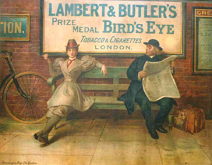
However, at the turn of the 20th century, tobacco companies directly appealed to women as the consumers of cigarettes. Lambert & Butler were inspired by the movement for women’s suffrage and emphasised the notion of ‘equality for women’. In 1900, this meant featuring a masculine woman in their advertisements. In this example from the Robert Opie collection, a woman (the ‘New Woman’) is publicly smoking on a bench next to a clergyman. She is dressed in male clothing from her boots to her hat, but the cinched-in waist emphasises her feminine figure and the puffed sleeves remind the viewer that the smoker is, in fact, a woman! Even her posture, by turn-of-the-century standards, is masculine; her arms are shrugged back as she reclines on the bench with her legs outstretched. The clergyman, who is presumably there to represent a traditional social standpoint, looks suitably unimpressed!
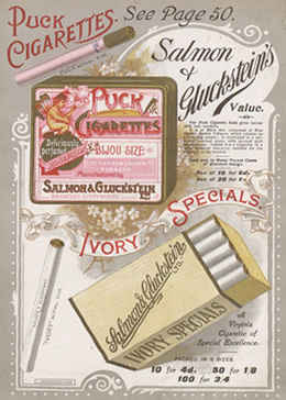 On the other hand, tobacconists such as Salmon & Gluckstein endeavoured to move away from the association between masculinity and smoking and rebranded their cigarettes to be more typically ‘feminine’. The Illustrated Price List Uniformly Current at all the Modern Trading Establishments of Salmon & Gluckstein, Limited (1899), featured in the Wills collection from the Bristol Record Office, highlights an alluring and colourful assortment of tobacco paraphernalia from packets of tobacco and cigars to silver-plated cigarette cases and ornamental ivory pipes.
This particular packaging for Puck Cigarettes is expressly directed at women. The pink colouring of the packet is immediately feminine as is the image of the smoking fairy complete with delicate butterfly wings. The cigarettes themselves are ‘Deliciously perfumed’ and rolled with ‘Rose Paper’ and the tobacco is nothing less than ‘Fine Garden Grown’. Deliberately crafted for dainty female hands, the small and elegant ‘Bijou Size’ cigarettes are an attempt to feminise the act and associated paraphernalia of smoking. This attempt to capture a female audience continued well into the 20th century and in the 1950s, advertisers portrayed the female smoker in her role as wife and mother.
It is fascinating to see how cigarette companies renewed their approach to suit women’s aspirations and social pressures throughout the 19th and 20th centuries, and how they developed aggressive and sophisticated marketing campaigns for influencing women and girls.
The Search for Gold in the Frozen North
Xavier Snowman
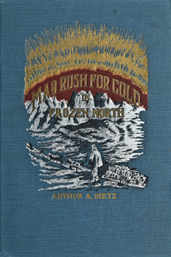 Mad Rush for Gold in the Frozen North describes the journey of eighteen men who left New York in the winter of 1897 in search of their fortunes in the Klondike. Supposedly written by the leader of the expedition, Arthur Dietz, the shocking account is unmatched for its portrayals of the suffering from frostbite, starvation, snow blindness and the agony of losing fellow adventurers. Despite the careful preparations of the adventurers, the journey was a disaster with only four of the eighteen men who embarked on the expedition making it out alive.
The evocative volume highlights the obsessive manner in which men and women have recklessly devoted their lives to the pursuit of riches. At the time of the expedition, exaggerated news stories instigated by the Seattle Post-Intelligencer created a throng of aspiring gold prospectors who were as inexperienced as they were impetuous.
“GOLD! GOLD! GOLD! GOLD! Sixty-eight Rich Men on the steamer Portland, STACKS OF YELLOW METAL!”
The headline rang in the ears of all those within the proximity of the newspaper boys, hawking at the top of their lungs. When the Portland docked, it was welcomed by a crowd of over 5,000 cheering Seattleites trying desperately to catch a glimpse of the ‘golden stacks’ and ‘filthy-rich’ miners back from their expeditions in the Klondike. Many quit their jobs on the spot and booked tickets for the next steam ship northbound. Gold fever had spread.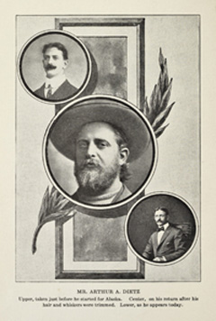
The journey was extremely perilous, and, at least for the vast majority, futile; only around 4,000 of the 100,000 who stampeded to the Klondike actually found any gold at all, and around 2,000 lost their lives. Ironically, it emerged that some of the chief beneficiaries of the gold rush were those who catered for it, selling gold mining supplies, survival equipment and foodstuffs at exorbitant rates.
Mad Rush for Gold is written to captivate its reader; punchy sentences and an unwavering emphasis on the extraordinary create a distinctly compelling narrative. The integrity of the account, however, has been called into question and the author often glaringly deploys artistic license to embellish his narrative. Early in the book for example, he records his astonishment at “the absence of night”, and then provides the reader with an account of the Northern Lights – an inexplicable phenomenon seeing as he claimed there was no darkness!
Whether you choose to believe the tale or not, the book remains valuable, providing an evocative account of the unforgiving wilderness that awaited those who embarked upon a treacherous journey in pursuit of their fortune.
Politically Correct Coffee
Georgina Phipps
One of my highlights of Global Commodities is the selection of objects from the Robert Opie Museum of Brands, Packaging and Advertising. These include packages from the 19th and 20th century of products such as Cadbury’s cocoa, Fry’s chocolate and Typhoo tea. Seeing how the design of these familiar brands has evolved over time to reflect changes in taste, attitudes and expectations, and to ensure that these products remain desirable to modern consumers, is fascinating.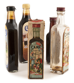
Although the development of most brands in our selection can be explained by changes in fashion, there is at least one item whose branding changes have more controversial roots. The product in question is Camp Coffee, a blend of coffee essence, chicory and sugar, first produced in 1876 by Paterson & Son in response to a request by Scottish soldiers serving in India for a coffee that would be quick and easy to brew while on campaign. The original label reflects these colonial and military origins; it depicts a Gordon Highlander sitting outside his tent, being served Camp Coffee by a Sikh soldier holding a tray.
While this was probably an effective marketing image in the heyday of the British Empire, over the course of the 20th century the depiction of a British soldier being waited on by a subservient Indian was increasingly regarded as anachronistic, racially offensive and an inappropriate expression of misplaced imperial nostalgia. The manufacturer reacted to this criticism by depriving the Sikh soldier of his tray, leaving him standing rather awkwardly at attention behind the Highlander sipping his coffee. This change placated no one; although the Indian was not overtly waiting upon the Scot, the implication of master and servant remained. Some shopkeepers even refused to stock the brand.
 The challenge for Camp Coffee was, therefore, how to update their brand sufficiently so as to no longer offend people, while maintaining enough continuity to remain familiar and allow the product to sell on the prestige of longevity. In 2006 a decision was at last reached. The latest label of the famous bottle now features the Sikh and Scottish soldiers sitting alongside each other, enjoying a convivial cup of coffee as equals.
Whether this is completely satisfactory, I leave to you to decide. I would like to think that the Gordon Highlander would approve of it as a step in the right direction. For according to legend, his real-life model is Victorian military hero Major General Sir Hector MacDonald, who after a remarkable career in which, through his valour and skill, he rose from the rank of private to general, ended up shooting himself in 1903 after being called to face a court martial on ‘grave charges’ of homosexuality. Because of his working class background, his preference when abroad for socialising with locals rather than the British ruling class, and persistent rumours about his sexuality, MacDonald was an outsider accustomed to prejudice and intolerance. I hope he would be pleased therefore that, over a hundred years after his death, his cartoon self has finally become a little more modern, and a little less provocative.
These fascinating Camp Coffee bottles are part of the Robert Opie Collection and are brought to life using a 360-degree
image viewer.